SankeyMATIC Gallery: FEC Reports
Visualizing Campaign Money Flows
FEC Disclosure Form: Friends of David Jolly
For the period 01/01/2014 – 02/19/2014
Data Source: FEC Disclosure Form 3 for Friends of David Jolly, filed 2/27/2014
This example was chosen fairly randomly* from 2014 FEC disclosure reports. Let's walk through how it was made.
* (I borrowed the link from
this tweet by
Derek Willis.)
Below are the original report's figures, with some $0 lines omitted.
(The amounts used in the above diagram's input are in bold.)
DETAILED SUMMARY PAGE
Of Receipts And Disbursements
| I. RECEIPTS | This Period |
|---|---|
| 11. Contributions (other than loans) From: | |
| (a) Individuals/Persons Other than Political Committees | |
| (i) Itemized | 274,894.72 |
| (ii) Unitemized | 27,577.00 |
| (iii) Total Of Contributions From Individuals | 302,471.72 |
| (b) Political Party Commitees | 10,000.00 |
| (c) Other Political Committees (such as PACS) | 226,100.00 |
| (d) The Candidate | 0.00 |
| (e) Total Contributions | 538,571.72 |
| 12. Transfers From Other Authorized Committees | 99,965.00 |
| 13. Loans | 0.00 |
| 14. Offsets to Operating Expenditures (Refunds, Rebates, etc) | 0.00 |
| 15. Other Receipts | 0.00 |
| 16. Total Receipts | 638,536.72 |
II. DISBURSEMENTS | |
| 17. Operating Expenditures | 529,301.90 |
| 18. Transfers to Other Authorized Committees | 0.00 |
| 19. Loan Repayments | 0.00 |
| 20. Refunds of Contributions | 0.00 |
| 21. Other Disbursements | 0.00 |
| 22. Total Disbursements | 529,301.90 |
III. CASH SUMMARY | |
| 23. Cash On Hand At Beginning Of Reporting Period | 72,954.53 |
| 24. Total Receipts This Period (line 16) | 638,536.72 |
| 25. Subtotal (23 + 24) | 711,491.25 |
| 26. Total Disbursements This Period (line 22) | 529,301.90 |
| 27. Cash On Hand At Close Of The Reporting Period (25 - 26) | 182,189.35 |
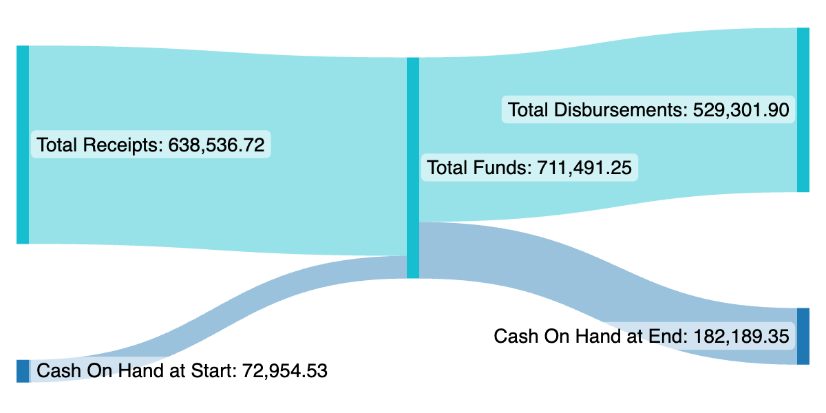
Begin with the bottom section of this report, “Cash Summary” (lines 23-27):
- “23. Cash on Hand At Beginning Of Reporting Period” plus “24. Total Receipts This Period” adds up to the total in line 25, $711,491.25.
- That total is then split into two amounts: “26. Total Disbursements This Period” and “27. Cash On Hand At Close Of The Reporting Period”.
Let's use SankeyMATIC to turn those numbers into a picture.
Entering these four lines in order:
produces output like this:

Note that the middle node (which I labeled Total Funds) matches the amount in line 25, but that specific amount was never specified in the inputs. Its amount is automatically set as the sum of all flows in or out of it (whichever is greater).
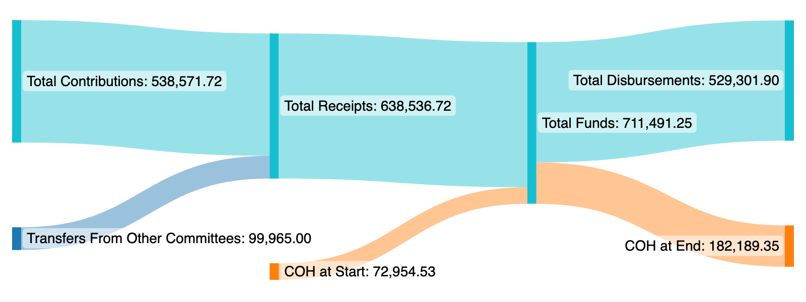
It can be useful to line up amounts to make comparisons easier. Specifically, being able to compare the “Cash On Hand” figures side-by-side could be handy.
Here I've changed the order of the first 2 lines to ensure that the 'Cash on Hand at Start' will be sorted at the bottom, where it can be directly compared to 'Cash on Hand at End':
Since the labels can make the diagram very wide, let's abbreviate Cash on Hand to "COH" from this point on.
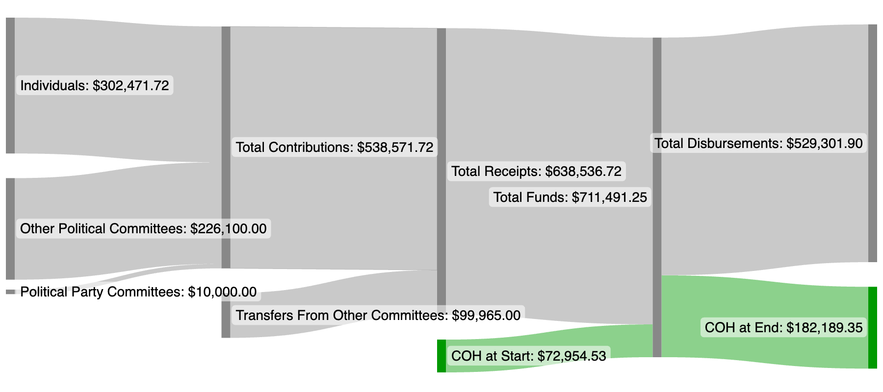
We can add some more detail to this diagram by exploring the other data lines.
The Total Receipts amount on line 24 is made up of multiple inputs: “11(e). Total Contributions” and “12. Transfers From Other Committees”.
Here's how it looks when we add those amounts flowing into Total Receipts (and make the diagram wider to make room):
(Note: The colors in a diagram are assigned in the order of the nodes' appearance in the source data. The Cash On Hand numbers are now mentioned later in the source data, so they were assigned a different color than above by default.)
We can go even further and add the breakdown of that Total Contributions amount from lines 11(a)-11(c).
In addition, we can change how the diagram is colored. Here I've updated the diagram to always use a neutral gray color unless there is a specific color assigned. In the last 2 lines of source data, I've added a green color (#090) to the COH nodes.
Finally, sometimes the layout works better with a different Node Height. Here I've increased it.
Here's how that can look:
Final Notes:
There is even more data from this report that can be added into the diagram, but it begins to get very wide—if you want to fit the diagram in a reasonable horizontal space, you may have to sacrifice the amounts in the labels, shrink the labels, and/or do a lot of abbreviating.
Below is a more extensive version of the diagram, with some shortened labels and a few more colors.
This version incorporates the breakdown of contributions from Individuals (itemized vs. unitemized) and also some of the information provided in Schedule C and Schedule D about Debts and Obligations owed by the Committee.
The Un-obligated Cash-On-Hand figure (at bottom right) was derived by subtracting the “Debts and Obligations Owed BY the Committee” (line 10 on the original report) from the “Cash On Hand At Close Of The Reporting Period” (line 27).
(If the Debts + Obligations had been greater than the Cash on Hand, my personal solution would be to add a new flow representing the difference/shortfall from a node named “Unfunded Obligations” and probably color the flow reddishly.)
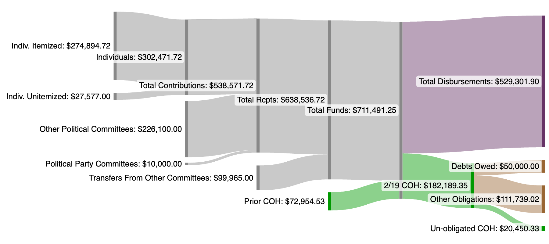
In addition to the above inputs, I adjusted various settings such as the Node Height and Spacing, the Label spacing & font size, and more.
See the Manual for more specific examples, or return to the Gallery home page, or go forth and try out a diagram of your own.